
Payment
Confirmation
Overview
The context of this case study is in the Banking Circle Connect platform. This web-based platform is our primary user-facing product. In Banking Circle Connect, our users can review their bank accounts, check their transactions and create new payments, among other tasks.
The payment confirmation is the most common feedback format a user receives after completing a payment. Think of it as a receipt after you make a purchase. Unfortunately, Banking Circle Connect was missing a shareable payment confirmation artifact.
In the following case study, I will tell how we fixed that for our users.
Role
Senior UX
Specialist
UX Research
UX & UI Design
User Testing
Time
Sept-Oct
2022
2 Month project
Team
Andreea (PO)
Poul (Insights)
Annika (Insights)
Paul (Frontend dev)
Oliver (Backend dev)
Active users survey
One of my main goals at Banking Circle was to help the organization understand our users better. To achieve this, one of my first activities was, in collaboration with the Insights department, to design and apply a survey to our platform’s active users. This survey was very successful and helped us guide our roadmap in a way that would impact our users most positively.
One of the main findings from the survey was that our users were struggling with the lack of payment confirmation on our platform. Many mentioned a specific type of payment confirmation they required, MT103 (a payment confirmation message generated by the SWIFT network).
Hypothesis
After reviewing the survey results, I met with Andreea, the product owner for payments. We agreed this was a problem for our users, she had some conversations with our colleagues in client services, and they could confirm they had been receiving a lot of requests for payment confirmations, specifically in the MT103 format.
This is why we came to the hypothesis:
If we provide a way for our users to download a payment confirmation in the MT103 format, it will improve their experience with our platform.
More research
Once we had agreed on a solution in text, it was my time to bring this solution to life in Figma. However, I had no idea how an MT103 looked. So I spent some time digging through google images and how other banks and financial institutions provided the MT103 payment confirmation. Here are some examples:
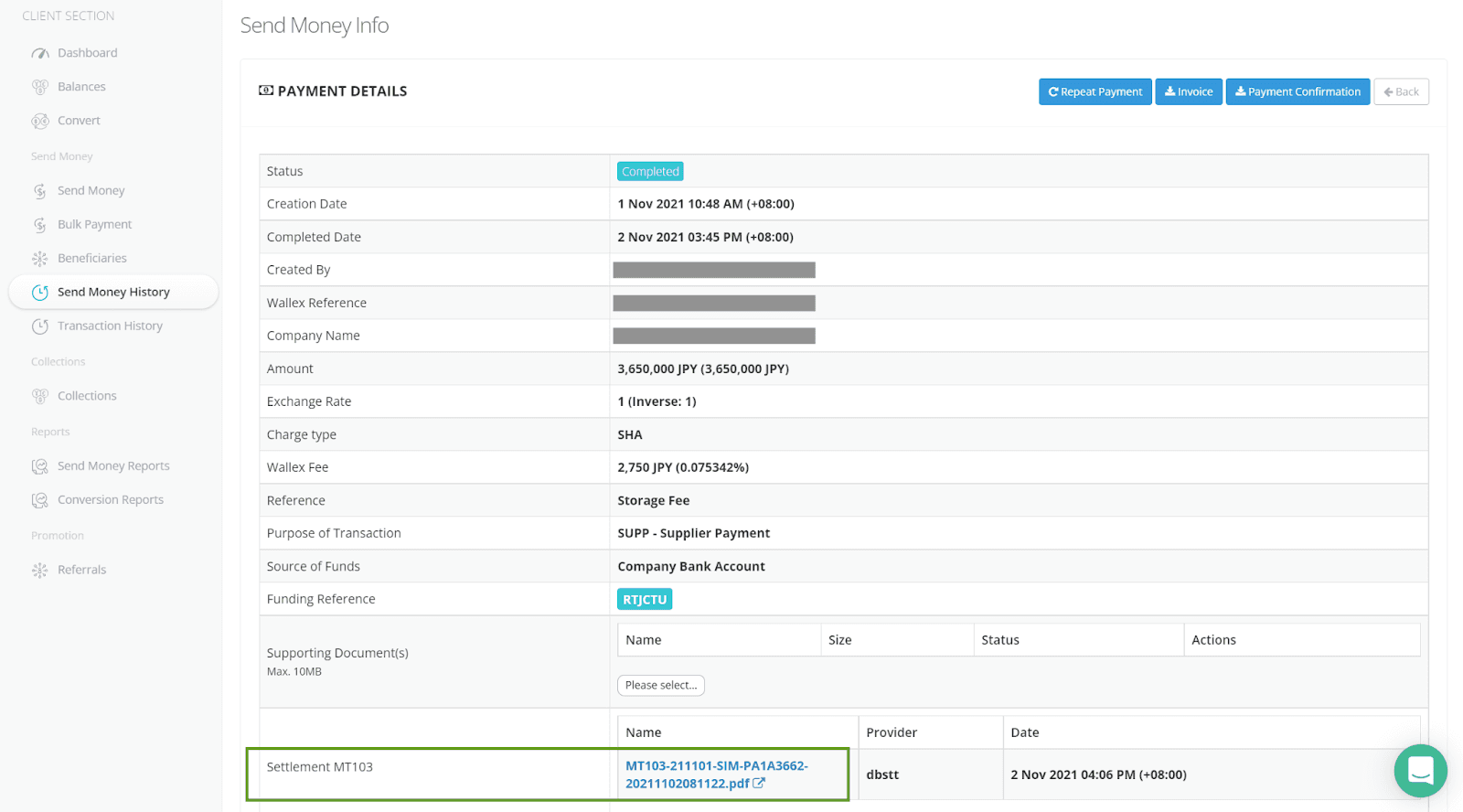
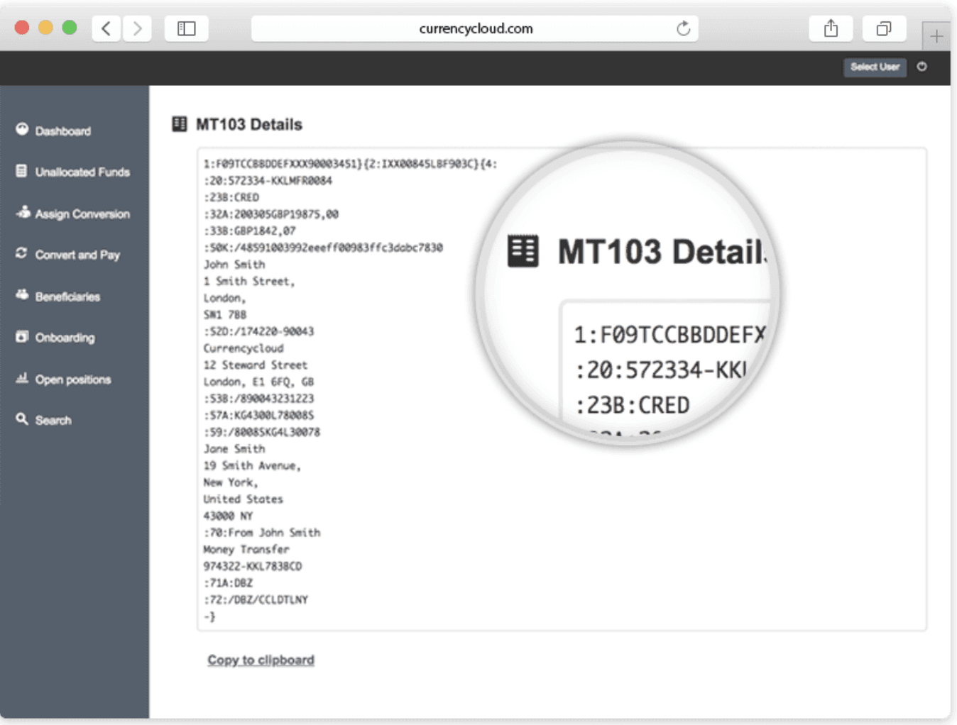
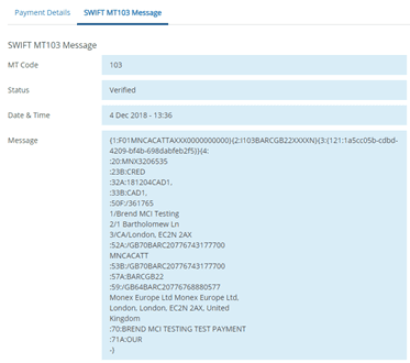
What I learned is that MT103s are messy and not human-readable, so this research brought me more questions. Do users want their payment confirmation in that format? Or should we translate it into something easy to read and understand?
Design
After my quick google research, I decided to jump into Figma and mock a few solutions to test them on some of our users.
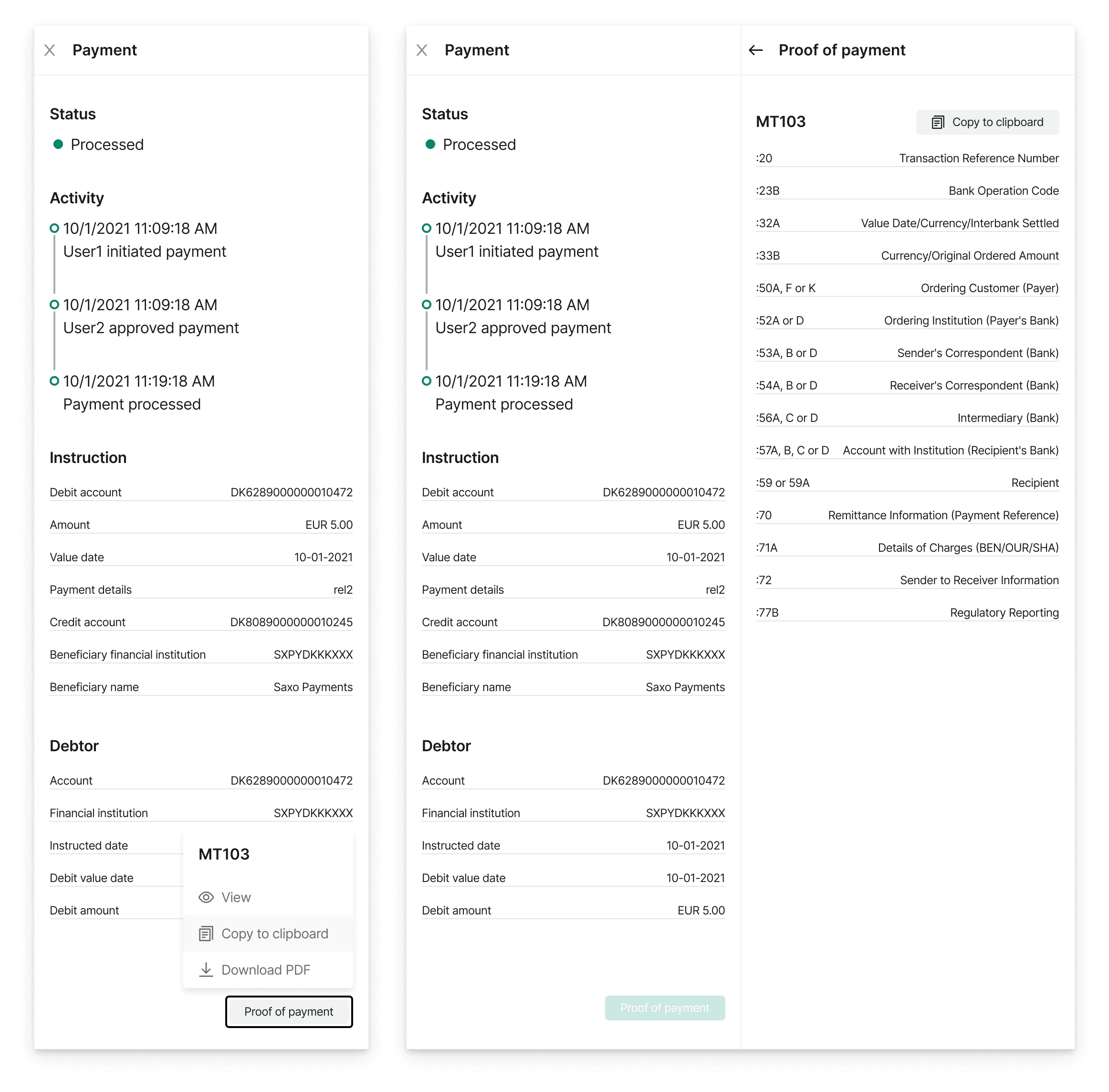
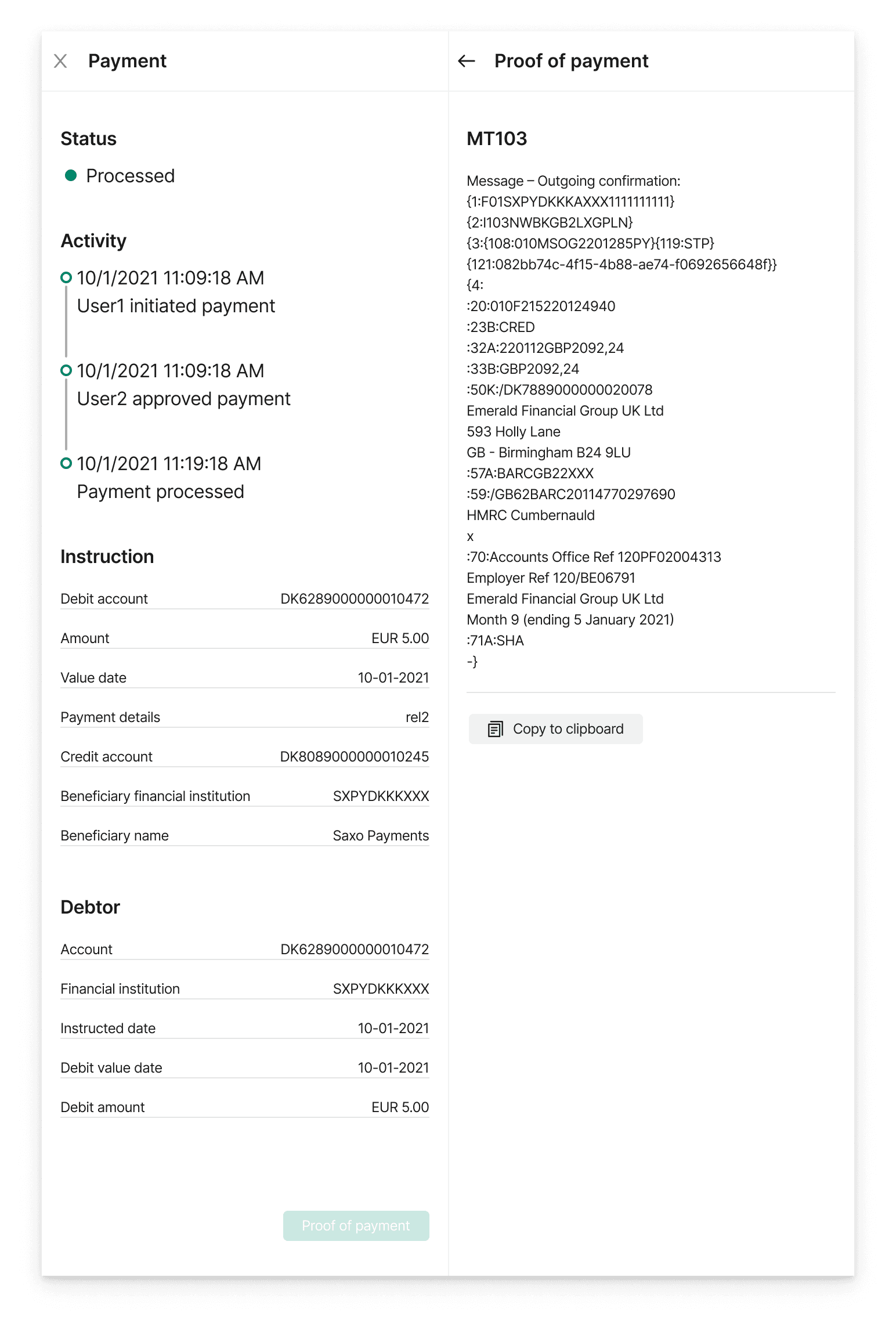
Our platform uses a sidebar to show payment details, so my idea was to place a button there, where a user could then view, copy to clipboard or download a pdf version of the MT103 payment confirmation. Also at this time, I was calling it Proof of payment, which together with some other ideas for displaying it got changed after a round of internal feedback.
The two options shown above are the structured MT103, making it easier to read and the raw one.
For user testing, I created an interactive prototype, you see it below test it here:
Payment Confirmation Figma Prototype
User testing
While doing research and working on the initial mockups, questions keep popping up. About the format and especially about what was the user going to do with this confirmation. This was important as it could influence our design decisions.
We decided to invite a few users for quick interviews around their needs, to show them our initial mockups, and listen to their feedback.
User 1
User 2
User 3
We managed to schedule talks with three users with varied use cases and organization sizes.
Test results = new hypothesis
The talks with the users turned out to be super insightful. We learned the main user need, something the survey couldn't provide us.
Our users, have clients of their own, and they send money to these clients regularly, for many different reasons sometimes these payments are delayed. When this happens, our users get a client calling them and asking about their missing payment. In this situation, they need something they can show their clients to let them know the payment was made and that it was just a matter of time before it appeared on their account.
We also learned that the main benefit of the MT103 was that it included a tracking code, with this code the recipient of a payment can contact their bank and the bank can locate the missing payment.
We also received feedback on the mockups I had created, the first user was happy with it, however, this user dealt mainly with other banks and financial institutions, so they and their users were very familiar with the MT103 format.
However, when showing the solution to the other two users, they were not so happy. They mentioned most of their clients are regular merchants who have no idea how to interpret such a format. What they need is not an MT103 but rather an official document from Banking Circle stating that the payment was completed and the main details about the payment.
So with the new findings, we came up with our new hypothesis:
If we provide a payment confirmation in an easy-to-read and share format (PDF) our users will be happy.
Feasibility
The next step was talking to our development team, so we had a conversation with our backend and frontend leads. The main goal of this conversation was to understand the feasibility of this feature and if we needed to do any compromises.
What we learned from this session was that 90% of the feature could be done by the frontend team alone, this was great as the backend team was busy with other projects.
We would only need the backend team to provide the tracking number found in the MT103 to complement the solution.
Final design + deployment plan
After the feasibility, I went back to Figma to finalize the designs and we agreed on a two-iteration deployment. First with the date currently accessible to our frontend team, and a second one with the additional information once the backend team had some capacity for it.
Additionally, we agreed on the metrics for success, we wanted to track how many users used the new solution and get in touch with client services to understand if the requests they were receiving were getting lower.

For the final design, we choose to simplify the solution, based on our user's feedback, only offering a downloadable pdf file with the payment status and relevant details.